
「更多福利资讯查看:2024首次大厂挑战」。
马上就要元宵节了,这里给大家端上一碗汤圆😁
首先放一个div(bowl_wrap),把我们要包裹的内容放在里面,需要它的原因是可以方便移动整体的位置,我这边将它放在页面的居中位置,以及对里面的元素进行位置调整(position)
<div class="bowl_wrap">
    ....
</div>
.bowl_wrap{
    width: 200px;
    height: 220px;
    margin: 100px auto;
    position: relative;
 }
 先画一个碗,这个碗呢我是分3个部分组合起来的,在一个圆的上半部分放一个椭圆,下面放一个div,都是通过
border-radius进行形状的改变
        <!-- 碗底 -->
        <div class="bowl_bottom"></div>
        <div class="bowl_body_wrap">
            <!-- <div class="text">汤圆节快乐!</div> -->
        </div>
        <!-- 碗口 -->
        <div class="bowl_rim">
            ...
        </div>
        .bowl_rim{
            position: absolute;
            top: 0px;
            width: 200px;
            height: 135px;
            background-color: rgb(247, 242, 235);
            border: 2px solid black;
            border-radius: 50% / 50%;
            overflow: hidden;
        }
        .bowl_bottom{
            position: absolute;
            top: 196px;
            left: 65px;
            width: 70px;
            height: 15px;
            background-color: rgb(247, 242, 235);
            border-radius: 0% 0% 80% 80%;
            border: 2px solid black;
            border-top: 0px solid black;
        }
        .bowl_body_wrap{
            position: absolute;
            width: 200px;
            height: 200px;
            background-color: rgb(247, 242, 235);
            border: 2px solid black;
            border-radius: 67% 68% 61% 62% / 48% 45% 86% 88% ;
        }
        .text{
            margin-left: 60px;
            margin-top: 160px;
            color: w;
        }
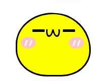
然后我们就开始制作汤圆,把它放进碗里(bowl_rim),超出的地方隐藏起来,汤圆的表情与很多,可以把每一个汤圆的表情都改变,我这个偷了个懒,都用的同一个
这里展示一下单个汤圆
       <div class="bowl_rim">
            <div class="two">
                <div class="left_eye"></div>
                <div class="right_eye"></div>
                <div class="mouth">
                    <div class="circle1"></div>
                    <div class="circle2"></div>
                </div>
                <div class="left_blusher"><div class="blu1"></div><div class="blu2"></div></div>
                <div class="right_blusher"><div class="blu1"></div><div class="blu2"></div></div>
            </div>
       </div>
汤圆的背景颜色可以根据自己的喜好更改,这里是黄色的(大黄豆皮~)
这个嘴巴就是用两个椭圆div旋转后,隐藏上半部分得到的
        .one, .two, .three, .four{
            position: absolute;
            top:45px;
            left: 0px;
            width: 95px;
            height: 80px;
            border: 2px solid black;
            background-color: #fff;
            border-radius: 67% 68% 52% 56% / 67% 79% 55% 57%  ;
        }
        .two{
            background-color: yellow;
            top: 0px;
            left: 60px;
            z-index: 10s;
        }
        .left_eye, .right_eye{
            position: absolute;
            top: 20px;
            left: 20px;
            width: 16px ;
            height: 3px;
            background-color: black;
        }
        .right_eye{
            left: 60px;
        }
        .left_blusher, .right_blusher{
            width: 20px ;
            height: 15px;
            background-color: pink;
            border-radius: 50% / 50%;
            position: absolute;
            top: 30px;
            left: 5px;
        }
        .right_blusher{
            left: 68px;
        }
        .blu1, .blu2{
            width: 2px;
            height: 8px;
            background-color: #fff;
            position: absolute;
            left: 6px;
            top: 4px;
            transform: rotate(20deg);
        }
        .blu2{
            left: 12px;
        }

        .mouth{
            position: absolute;
            top: 20px;
            left: 38px;
            width: 20px;
            height: 20px;
            overflow: hidden;
        }
        .mouth .circle1, .mouth .circle2{
            margin-top: -10px;
            width: 6px;
            height: 16px;
            border-radius: 50% / 50%;
            border: 2px solid black;
            transform: rotate(10deg);
        }
        .mouth .circle2{
            margin-left: 8px;
            margin-top: -20px;
            transform: rotate(-10deg);
        }
有疑问加站长微信联系(非本文作者))


go呢?你类名用go也行啊